Friday, September 14, 2018
Gallery Photo
I believe that this gallery photo is interesting because it is very rustic and dark. Although this monochromatic image makes me feel uninvited it puts me at peace. The camera’s position creates asymmetry as the girl starts to shut the door to welcome a new, more rebellious chapter in life. To me the girl’s stoic expression creates an eerie yet calming feeling.
Image Choice Chey B.
I like the image above because it possesses the principle of symmetry and variety. The side window panes and pillars depict lines and in these vertical lines they force me to look up at the floating books. At first glance, the books on this London street appear to be levitating in space which is pretty cool because it reminds me of a scene right out of a Harry Potter movie. However they also possess a deeper meaning because to me these floating books symbolize the unsurpassable height and wonders of knowledge.
In addition there is moderate saturation throughout the photo. The colors in this image from the pillars to the floating books all have the same color scheme. When I think of a book in relation to color I think of black and brown because books are usually perceived as a boring and useless tool of nothing by the millennials of my age. But the photographer’s use of exciting colors like blues, reds, and greens makes me view learning and reading in a more positive perspective. Photographers often use certain colors as a vehicle to express a certain story. For example when using unsaturated cool colors the photographer is usually aiming to potray sadness.
Color project
This photo I chose from the internet represents unity because of how the different shades of blue work in harmony together. This could also be counted as emphasis because the darker colors are along the border. Then once you look towards the center of the painting, the shades get lighter and lighter and you eyes go straight to the lightest and brightest part of the painting.
Allie A Gallery photo
I liked this photo because it clearly shows the differences between the guy and the girl. i also like that it is monochromatic.
Appealing image to do with color
I find this picture appealing because I believe it describes a different culture then most average Americans are not used to. As far as principles and elements, this photo is monochromatic and I would say it represents rhythm because it has different patterns and shapes to emphasize the women and her children.
This black and white tone as well as the women's face sets a dreary/ sad mood. Looking at this image, since the children are hiding behind their mother's back it makes me think of some type of war that they don't want to be exposed to.
Blog Color Post

This photo shows two principles of design. The first principle of design that this picture shows is unity. The colors and blend together beautifully. The next principle of design that is portrayed in this photo is repetition. The lanterns being repeated is an example. The lanterns being reflected off of the water adds to the unity as well.
The purpose of color in this photo is to show revival in color. The lifting of the lanterns makes me feel sad but at the same time I feel uplifted.
Thursday, September 13, 2018
color photo project Allie A
This photo is successful because upon further research, the model standing in the photo is a very successful and obviously handsome musical artist internationally. The Principles of Design used the photo is Contrast and Emphasis. One of the principles is Contrast because the photographer is contrasting the bright and bold colors of his suit jacket and hair with the calm and mellow blues in the back of the photo. The second principle is Emohasis because the photographer is emphasizing the models stance and bold colors he is wearing. The Elements of Design used in this photo are Texture and Colour. Texture is being used in the photo because you can see velvetyness of his jacket, smoothness of his button down and the body (thick healthy appearance of hair) of his two sided hair. Colour is being used in this photo, as I stated formerly, as the bolds of his jacket stand out compared to the blurred background.
The purpose of color in this photo is to clearly show off his form and stance and aura he is giving off. His mysterious look, his serious facial expression and his confident but relaxed posture with slight coyness. Color can alter the meaning of and emotion by the aura the color gives off. For example, if the model had been dressed in darks and blacks, he would have been seen as brooding and serious instead of confident. It can change the emotion by the brightness or darkness. For example, red you feel anger but with pink you feel happy while with blues you feel calm or sad and grey you feel tired. It changes based off the impact it has to your senses.
Movement
This photo caught my eye. When I first looked at it, the squiggled line made my eye move throughout the photo. I also really like how the road is a plain neutral color because it stands from all the busy surroundings. The path is also emphasized because there are bushes surrounding it that are mostly the same color. Along with making the path pop, the bushes help the reader's eyes to move with the path smoothly. I also like how the road is in the center of the frame because it helps the reader's eyes to go strait to the path.
The colors of the photo really add to the movement and appeal of this photo. I like how everything is mostly neutral even though though there are small pops of color, such as the pool, the red car, and the plants. I also think that the unique beige color of the road helps draw the reader's eye to it. The colors also help the reader to feel peaceful, and still, even though there is a lot of movement and things happening in this photo.
Emphasis
This photo caught my eye because it has a pop of color that shows the principle design which is emphasis. The image is in focus and is of two of my favorite fruits. Both the type of berries compliment each other. It makes your eyes go strait to the center which is what emphasis basically is. The black and red compliment each other because of the way it emphasizes the raspberry. This is why the photo which represents emphasis caught my eye.
Another reason the photo caught my eye is because of the color which I briefly touched on in the paragraph above. As I said earlier, the red and the black of the berries brings out a perspective in each other of darkness. The red could symbolize blood or something of a dark nature while the black represents darkness or evil. It also reminds me of the spider that is red and black and I think it is a black widow but I can't remember right now. It's also bringing the essence of halloween which is a little over a month away. This is why the image has a great pop of color which pulls the entire image together.
Katie Reinhardt POD
I chose this image because I liked how the reflection made a complete circle. This image shows many principles of design such as balance, emphasis, and unity. It shows balance because of how in the water it shows a pretty clear replica of the trees and the arch. This image also shows unity because of all the different shapes and colors. The use of the color in the trees shows that it is almost fall because of the color changing on the leaves. With the colors of the trees it also puts emphasis on the arch. So your eyes will go towards the circle the arch makes with the water reflection.
Sydney's color photo
I picked this image because it really emphasized the tiger. His head cocked in that position looks like he looking at you. The water droplets serve as a frame for the tiger, they also give the image a certain depth.
The use of color emphasizes the tiger. The bright orange stands out against the bleak color of the water droplets. This allows your eye to go straight to the tiger.

This photo uses symmetry as one of the principals of design. The elephant is in the center of the page, and is looking straight onto the camera. The dead bushes in the background emphasizes the elephant in the center. There is also repetition in the wrinkles of the elephants face.The photo has a kind of sadness to it and makes you wonder why everything is dead. The elephant's expresses the same emotion with the look on its face.
The photo is in black and white and I think that it is extremely important in the meaning of the photo. The elephant is also alone, with dead bushes around it, this combined with the black and white makes the mood of the photo sad and mysterious.
I like this image because it displays variety. It takes your eye around the photo. The blue in the water makes the sea seem very peaceful and cool. It is also sort of scary due to the fact that there is a man walking on a tightrope.
This photo is successful because the colors mix together and create a feeling of unity. The figure in the center is emphasized, and the background is a little blurred out, which even further emphasizes the girl in the middle. The cars moving in the background make the figure in the middle seem as though she is stopped in time.
The purpose of the colors in this photo are to make the viewer feel calm while looking at it. There are a lot of blues and pinks, and the little lights in the background. Cool colors can make an image feel more relaxed and less vibrant, and take the focus off of certain objects in the photo. Warm, vibrant colors make the photo feel energetic and lead your focus straight to certain objects in the photo.
I really like this photo i like it because it draws my eye to the middle while there is a lot of colors and details around it.
Clayton Color
I choose this picture because I like how the colors of the umbrella draw your eyes to the center of the photograph and how the contrast to the mostly monochromatic rest of the photo. I also like how the tress make you look down the path and lead your eyes. I also like how the photo makes you think about the person and why she's there. I like photos that are Mysterious and tell a story
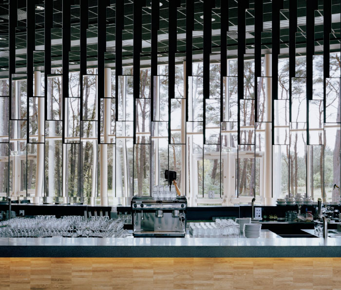
I chose this image because the rhythm of the glasses and the mirrors behind cause your eye to move in different places. I also like how it is mainly monochromatic.
Color Photo Project
I chose this photo because all the colors just really stand out. It gives me a very calm and happy feeling. Its successful because it just all comes together as one and its very clear. It shows the elements Unity and Variety. There's a variety of colors and they all seem to come together into this one big image. The colors are all very bright and they stand out, the reflection in the water helps lead your eyes back up to the buildings and homes.
I picked this photo because of the different elements portrayed in the piece. The most obvious element is emphasis. The picture directs the viewers eyes to the center of the photo where the diver is shown. The picture also depicts movement as the viewers eyes move across the photo as the the fish move across the water. Unity is also an element portrayed in the photo because it shows a sense of completeness.
The main color scheme is a dark blue which is shown as a theme throughout the photo. The emphasis of the photo is shown in the center of the photo as more light is captured there. Making the outer parts of the photo darker and gives a scents of mystery. This makes a variety of blue hues all over the photo. I chose this photo because of the many different principles of design and the color scheme that is portrayed throughout the photo.
blog post POD
This photo caught my eye because of the many shades of purple caught in the image. The purple aesthetic is very pleasing to the eye and makes me feel calm and sleepy. This photo represents two principles of design. One principle represented is repetition because of the plants that are lined up along the side of the windows. The plants are all the same size, but the way the photo is captured makes it seem as if all of the plants are different sizes. Movement could also be seen in this photo because when looking at the photo, your eyes automatically follow the "trail" of the plants.
I picked this picture because I really like the color of the flowers and the background. I like how the green and black background makes the baby blue pop and how the baby blue makes the yellow pop. I also like how all the flowers have white coming out around the yellow and it looks like a star. It's cool how they appear as different sizes and there's also a flower that hasn't bloomed yet kind of representing growth.
I think the photo shows asymmetry, proportion, and emphasis. The way that the flowers are the only thing in focus and the way the background isn't complicated. This photo really pops to me and makes me really happy.
Monday, September 3, 2018
gallery photo
I like this photo because of the color of the flowers and how the neutral background emphasizes the flowers.
Picture
I chose this picture because it shows a lot of emotion and is complimented by the model, and the black and white setting.
Subscribe to:
Comments (Atom)


