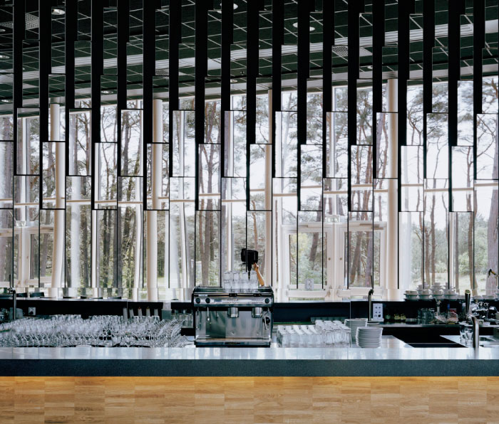
 I chose this image because the rhythm of the glasses and the mirrors behind cause your eye to move in different places. I also like how it is mainly monochromatic.
Thursday, September 13, 2018

Color Photo Project

I chose this photo because all the colors just really stand out. It gives me a very calm and happy feeling. Its successful because it just all comes together as one and its very clear. It shows the elements Unity and Variety. There's a variety of colors and they all seem to come together into this one big image. The colors are all very bright and they stand out, the reflection in the water helps lead your eyes back up to the buildings and homes.

I picked this photo because of the different elements portrayed in the piece. The most obvious element is emphasis. The picture directs the viewers eyes to the center of the photo where the diver is shown. The picture also depicts movement as the viewers eyes move across the photo as the the fish move across the water. Unity is also an element portrayed in the photo because it shows a sense of completeness.
The main color scheme is a dark blue which is shown as a theme throughout the photo. The emphasis of the photo is shown in the center of the photo as more light is captured there. Making the outer parts of the photo darker and gives a scents of mystery. This makes a variety of blue hues all over the photo. I chose this photo because of the many different principles of design and the color scheme that is portrayed throughout the photo.
blog post POD


I picked this picture because I really like the color of the flowers and the background. I like how the green and black background makes the baby blue pop and how the baby blue makes the yellow pop. I also like how all the flowers have white coming out around the yellow and it looks like a star. It's cool how they appear as different sizes and there's also a flower that hasn't bloomed yet kind of representing growth.
I think the photo shows asymmetry, proportion, and emphasis. The way that the flowers are the only thing in focus and the way the background isn't complicated. This photo really pops to me and makes me really happy.
Monday, September 3, 2018
gallery photo

I like this photo because of the color of the flowers and how the neutral background emphasizes the flowers.
Picture
I chose this picture because it shows a lot of emotion and is complimented by the model, and the black and white setting.
Subscribe to:
Posts (Atom)