Thursday, November 8, 2018

Clayton Ad blog

Ad Project

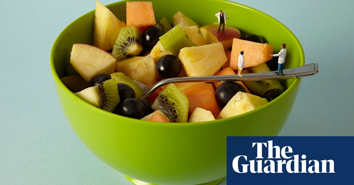
     I think this ad was successful because of the emphasis on the logo and the actual cookie. Because the lack of other things in the image your eyes are immediatley drawn to the cookie because it is surroundedd in white and then your eyes are drawn to the words and the logo.


     For my project I was thinking of doing bakery foods like muffins, cookies, etc. I think this is a good idea because I can really get creative with the things I bring in since it can be different things, and we can eat what I bring in after. 

Ad Project


This image of a vintage GI Joe commercial stood out to me because of immersive it makes you feel. The producers created a whole scene for the viewers to see and the child to relate with. I like how it almost feels real. With the soldiers walking and the kid leading them Hasbro draws you in to by one. They marketed this perfectly because after the war new toys were being created. Barbie was for girls and there was really no boy toy. They marketed this for young males fond of war considering there dads probably fought. Their motto is its not a doll its an action figure, sparked the new toys as we know it.

I want to do a toy but not just any toy. My toy Brick can do ANYTHING you want. Want it to be a car boom it is. Need a doll boom it is. My toy is very versatile. My idea for my pictures would be to put the brick in different situation. Like having it drive down a model road. I am going to make a dip tip of a child holding the brick as if were an airplane and have that picture besides one with him holding an airplane to show the correlation. My toy will be designed for children but adults could use it to. As a gag I will show at the end a picture of a brick house and say you can collect them all

Wednesday, November 7, 2018

Ad project


I chose this advertisement because it uses a lot of red which attracts the eye. Also the coke bottles against the white background makes it pop. It is advertising sharing a coke with a friend and it makes costumers want to buy a coke and share it with someone.

For my project I want to advertise a cupcake shop. I will use many bright colors against a white backdrop. Also maybe a black backdrop if my colors work well, it might give the objects more of a pop. I will use sprinkles, I may spill cupcake batter onto a surface, use piping bags for frosting, and use cupcake pans/tins.

AD PROJECT

Image result for makeup adsImage result for makeup ads
     
This advertisement is a great ad because it gets the viewers attention through video, audio and pictures. It is a simple ad, but yet is able to hold the readers attention because it is short and sweet, and has irresistible products. They formed a well organized shoot with a well known model, bright lights, and made the product the center of attention.

For my project, I am going to be using 3 types of makeup to focus on. Mascara, highlighter, and eyeshadow.  The highlighter and eyeshadow come in a variety of colors. I am using the different colors and shades to contrast each other and create different shades of pigments to reflect off of each other and the light. I am also going to use the dark mascara to contrast the bright shades of the highlighters and eyeshadows.


Ad- Lee Tritt

Image result for ads of candles

I was immediately drawn to this image because the image is very monochromatic. Also, another aspect of the image that is very cool is the blurred top to the candle in the background. The photographer utilized shallow depth of field very well. Finally, I like how the wick is lit. This adds a idea of peace that now gets attached to the photo. I would not feel this same connotation if they wick was unlit.

 I plan too also use shallow depth of field on some of the images, but on one, I plan to utilize a deep depth of field to create an image of peace with the candle in the middle of my family cozied up on a couch. This would show the serenity effect a candle has. I also am making an image that has wax dripping down the side of the candle. For another image, I will have one large candle in the middle, and small ones behind creating more light and making the larger one a bigger focus.

Ad project

Image result for good advertisement fruit bowl little people

this advertisment is successful because of the background color contrasting with the color of the bowl. the little people on the spoon and in the bowl create interest in the photo itself. the fruits that  the photographer chose compliment each other as well as the green in the bowl. I think the lighting in the photo creates a good balance in the photo because the people are on the right side of the photo while the light is on the left. I also like the logo because while it is very simple, and seems to give to the adult aspect of the photo, the little people make it seem more childlike.

for my project, i plan to use pasta. I want to make some kind of pasta string or necklace type things to hang down, i would use uncooked pasta for this. for my first day of shooting, i would use colored uncooked pasta on a white background. then when i shoot the second day, i will do white pasta on colored background.

Ad project


I chose this ad because I like how the ad Taiwan your focus away from the drinks opponent and shows off the benefits of the product. I also like how they set up the shot.  The monochrome of black white and green also brings your attention back to the drink amen hand. I also liked how at the bottom they put a small summary (?) at the bottom talking about the drink and what they are advertising about the drink.

I will shoot my ad with soda and try to focus on the bubbles and glass of the drink. I will use a white/black  back drop to keep the focus only on the drink and not distract wit any colors. Similar to this ad. I would like to plan to bring in an object to bring a vibrancy to the shoot I will do, maybe a flower or food. 

Advertisment project


       I think that it’s advertisement was successful because of the way it is presented and the way that it’s worded. The red background gives it a very bland setting so that ur eyes dart straight to the main point of focus. I also enjoy that the background is red because it makes u hungry but also helps to represent the spice of the red peppers used to make the hot sauce. The fire extinguisher design shows that it’s fiery and attracts you to try it. I also like the wording used it’s very minimal but it stands out in white And simply just gets the point across “beware the heat” which also shows it’s really spicy. The logo in the middle is slightly covered which I don’t like but the cover is right above the brand name to make sure u can still understand which brand is being advertised.


      For my projects I’m going to do bananas. I want to use the bananas on a blue back to contrast and  make the yellow pop. I also want to use the bananas and throw them in the air outside infront of the river to use the blue to contrast the yellow and to give a good background to my image. I would take pictures of the bunch of bananas and then sliced up bananas and maybe even a banana smoothie. I want to use the natural colors outside to show the nature color of the bananas.


ad project


This ad inspired not just because I like food, but I also like other things about it. I like the proportion between the cup and the fries, I also like how the fries are in a McFlurry cup. The simplicity of this picture makes you focus on the fries and how much you want to eat them, therefore it is not very distracting and you focus on the project they’re trying to sell you. After I take my eyes off the fries they move directly to the cup, and then it makes me want a McFlurry.


My ad project will be focusing on creamer/ cream. The name of my product will be “The Color to my Cream”. My slogan will be “start your day off with a POP of color”. I will take food dye, and edible glitter, possibly just glitter, and add it to my creamer. I will use a white backdrop to keep it simple so all the focus will be on the creamer and the glitter. I might also use things like icing. I am very excited to work on this project because I have so many ideas and forms of how to use the creamer and the color to create what I hope will be a beautiful and eye catching image.

Ad Project

Image result for gummy worms ad
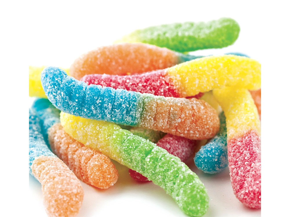
I chose this photo as inspiration for my advertisement because of the way the texture of the worms and their sugar coating can be seen. I love the simplicity of the image but also the colors that contrast each other in many different ways. My goal is to be as creative as possible when doing this project and create unique photos that make everyone drool over the gummy worms.

Ad Project

Image result


      This advertisement is successful because of the contrast of the colors. The red of the KitKat wrapper really pops because it is on the brown bench. Also, the use of the bench as the KitKat bar makes the eye of the viewer go down the bench because of the horizontal lines. The background color being dull always the eye to focus on the KitKat. Furthermore the man sitting on the bench is facing away from the bench drawing the attention away from himself, while also putting emphasis that the KitKat bar is indeed a bench.
     For my advertisement project I want to photograph bath salts. I want to take portray them as a fun everyday item. Some ideas I have are taking a picture with them thrown in the air while a person is in a bathtub filled with bath salts. Also I want to use other colorful household items such as flowers and take pictures with a rainbow assortment of bath salts. Another idea I have is to put them in bottles or mason jars and have them on a dark or light background, but have the focus just on the salts. Also, have the salts in piles in rainbow order and make them trail down to a bottle full of salts.


Ad Project

I chose this ad because I like the simplicity of it. The focus is directly on the product with a blurry background. This photo is successful because the cans are composed to get slightly smaller as your eye travels to the back of the photo, with the main flavor showcased in the middle front. The new design of the Diet Coke cans give a more modern vibe to the product as well. I also like the slogan associated with the brand, which gives off a “life is short” vibe.


My project idea is cereal. I want to paint normal cereal boxes different colors and take photos of the boxes and different types of cereal as well as just the cereal itself. I want to try incorporating other objects into my photos to make them more interesting, such as fruits with Froot Loops cereal, glitter, or splatter painting the backdrop in my photos. I would also like to do one photo where I design the cereal into the shape of my logo/
Image result for doritos superbowl commercial 2018

This ad is successful because the symmetry with the chairs and the background adds emphasis on the actor. I also think the movement of the fire helps the ad become more captivating and interesting. I think the lighting is a very interesting choice. The focal point is very dark and around him is lighter. Lastly, I like how the actor appears to be walking on light. It adds emphasize on him.
My projects theme is ribbons. I have about 15 different colors, patterns, widths, lengths, material ribbons and for one shot I would have them all intertwined on the table. I would also like to hang them from a clear string or ribbon. I also think that tying them into neat bows and putting them in rows and columns would have a nice affect. I would also like to explore throwing them. For the most part, I would like there to be larger shadow to create a sense of depth.

ad project

I like this ad because it gives you a different perspective on ketchup. The ketchup bottle is portrayed as just cut up tomatoes and not a plastic container. I also like how this ad chooses the right color red as a background to match the tomatoes.

For my project I chose to do toy cars. I want to shoot the cars at a perspective that they look the same size of a real car.  In the studio I would like to set the cars on top of a map or have the cars surrounded by I also want to take pictures of the cars on asphalt to portray the cars driving on the road.

AD Project


the reason I chose this ad is that Mclaren put their bright orange car on a dull monotone mountain. the image focuses on the car while still showing movement, the background is blurred but the car is focused. I like how they chose a bright colour to really highlight the main reason for this ad, the car. 

In my project, I would like to work with something colourful like crayons or pencils to have a photo that does not look off or has an unclean look to it. I hope to create a bright clean photo that I can make original and cool.
I decided to choose the Nike Running add of boys versus girls for this project. This add is very successful because of the contrasts in the colors and the glow of neon in the background. The photo is very organized but also very captivating with its theme of boys versus girls. The logo is in the top right corner which helps show the tension in the contest. The black and white also helps to make it stand out.

For my project I was planning on using multiple types of makeup  on different backgrounds to bring out the makeup. I would also use glitter and lights to focus on the makeup. I would under expose to help keep the focus on the colors and makeup.

I think this ad is successful because of the point of view from which the photographer shot it from. They shot this photo looking up on the bottle, making it look very big and magnificent. The black background makes the brown drink stand out. The lighting makes the bottle look as if it is glowing. All the water particles in stop motion and the droplets running down the bottle make the viewer think of a cold and refreshing feeling.


For my project, I would like to shoot balloons. I would like to do science experiments with balloons such as the baking soda and vinegar experiment. I want my overall theme to be very happy and playful. I want to do silly things like draw faces on the balloons and then blow them up. As my main picture, I want to fill a balloon with confetti or glitter and pop it. I would like to catch the balloon in mid-explosion.

Advertisement


For this project, I chose to focus on a treat that makes people happy, cookies! Anyone you could possibly think of right now loves cookie, and my ad is meant to get people in the mood to have some.

Ad project

  I chose this this target ad because the colors draw he viewers attention because they are so bright and makes people want to buy their products. Using kids as models also brings a family friendly vibe to the scene. The company also shows diversity by having a child with a disability in a wheelchair.

For my advertisement project I would like to use flowers and plants to create an atmosphere to go out into the world and experience everything. I will do this by using lights and using food coloring to add color to the already vibrant flowers. I also plan to under expose so that the flower is the main focus of the image.

AD PROJECT


I chose this ad from Visa because it allows the viewer to relate to being busy and on the go. In this campaign they state “Life Takes....” which permits for the viewers to again relate and consider that the object they are trying to sell will HELP them. They also are trying to convince the viewer that only their item can help them. When selecting this image I was also drawn to it by their choice of bold and captivating colors. I would 10/10 chose this company for a credit card because they make it seem like they care about your daily life! 


I am beyond thrilled to photo shoot jello for my project! In this campaign they provide different ways to use and eat jello. In my project, I will be focusing primarily on the texture and structure of the jello because it will look more captivating than this image. I do love how in the top picture of jello you can  vividly see the structure of the jello. But with technology being far more advanced than when this campaign was designed, hopefully my camera and scenery will be able to emphasize this amazing food.

Chey Ann Boyd Ad Project


In the two screen shots of ads above I found key elements supporting how a product should be
sold. In the first image there are a group of business professionals gathered around a meeting discussing the things they love most about Haribo Gummies. In the ad, the professional adults are voiced over by children to express the irony and humor of adults being so infatuated with sweets like a kid would in a candy store. In my opinion this ad does a good job pitching its product because it uses irony to promote the fact that all consumers no matter what age would enjoy what it offers. It’s clear that appealing to all audiences can make a product really successful. In addition, the ad below the Haribo also does a good job to pitch its product because it doesn’t fail to create a dramatic scene to demonstrate why the product is needed. This ad aims to sell Ziploc Bags, in doing so it shows a mom thinking ahead to pack her daughter’s lunch with a Ziploc Bag to ensure that her child won’t create any cafeteria chaos by busting the bag of chips everywhere. This ad shows the importance of selling a product that a consumer would find useful in their daily life.


In my ad for the photo project I am selling marshmallows. In the ad itself I want to incorporate motion and vibrancy throughout. Why marshmallows? I want to show the many creative ways one can enjoy a marshmallow better than any other sweet treat. Not only is it a sweet treat, but it also symbolizes the importance of family and joy. At the end of this project I hope to prove that marshmallows are a necessity in one’s life.


Tuesday, November 6, 2018

Ad Project by Lauren Avery

Related imageImage result for food ad campaign ideas

I chose these images food ad campaigns above for many reasons.  I was drawn to the first image  
because of the simplicity as well as the white background.  This image draws ur attention straight to the kiwi which is what is needed. However, I also like the second image because of the creativity and the fun aspect of it. The people viewing that ad will never forget it because of the creativity of the creator. 

Image result for funny strawberry adsImage result for funny strawberry ads
I plan on doing my ad project using strawberries. I want to make them look human-ish by adding googly eyes and possibly eyebrows and a mouth like the first example above. I also want to give the strawberry arms and legs to give it an extra "wow factor". I will then try and use these arms and legs to make the strawberry "stirke a pose" as I plan to name my brand "Striking Strawberries".

Friday, September 14, 2018

Gallery Photo


I believe that this gallery photo is interesting because it is very rustic and dark. Although this monochromatic image makes me feel uninvited it puts me at peace. The camera’s position creates asymmetry as the girl starts to shut the door to welcome a new, more rebellious chapter in life. To me the girl’s stoic expression creates an eerie yet calming feeling.

Image Choice Chey B.


I like the image above because it possesses the principle of symmetry and variety. The side window panes and pillars depict lines and in these vertical lines they force me to look up at the floating books. At first glance, the books on this London street appear to be levitating in space which is pretty cool because it reminds me of a scene right out of a Harry Potter movie. However they also possess a deeper meaning because to me these floating books symbolize the unsurpassable height and wonders of knowledge.

In addition there is moderate saturation throughout the photo. The colors in this image from the pillars to the floating books all have the same color scheme. When I think of a book in relation to color I think of black and brown because books are usually perceived as a boring and useless tool of nothing by the millennials of my age. But the photographer’s use of exciting colors like blues, reds, and greens makes me view learning and reading in a more positive perspective. Photographers often use certain colors as a vehicle to express a certain story. For example when using unsaturated cool colors the photographer is usually aiming to potray sadness.

Color project

This photo I chose from the internet represents unity  because of how the different shades of blue work in harmony together. This could also be counted as emphasis because the darker colors are along the border. Then once you look towards the center of the painting, the shades get lighter and lighter and you eyes go straight to the lightest and brightest part of the painting.

Allie A Gallery photo


I liked this photo because it clearly shows the differences between the guy and the girl. i also like that it is monochromatic.

Appealing image to do with color

Image result for appealing photographic images
     I find this picture appealing because I believe it describes a different culture then most average Americans are not used to. As far as principles and elements, this photo is monochromatic and I would say it represents rhythm because it has different patterns and shapes to emphasize the women and her children.
     This black and white tone as well as the women's face sets a dreary/ sad mood. Looking at this image, since the children are hiding behind their mother's back it makes me think of some type of war that they don't want to be exposed to.

Blog Color Post


This photo shows two principles of design. The first principle of design that this picture shows is unity. The colors and blend together beautifully. The next principle of design that is portrayed in this photo is repetition. The lanterns being repeated is an example.  The lanterns being reflected off of the water adds to the unity as well. 

The purpose of color in this photo is to show revival in color. The lifting of the lanterns makes me feel sad but at the same time I feel uplifted. 

Thursday, September 13, 2018

color photo project Allie A


   This photo is successful because upon further research, the model standing in the photo is a very successful and obviously handsome musical artist internationally. The Principles of Design used the photo is Contrast and Emphasis. One of the principles is Contrast because the photographer is contrasting the bright and bold colors of his suit jacket and hair with the calm and mellow blues in the back of the photo. The second principle is Emohasis because the photographer is emphasizing the models stance and bold colors he is wearing. The Elements of Design used in this photo are Texture and Colour. Texture is being used in the photo because you can see velvetyness of his jacket, smoothness of his button down and the body (thick healthy appearance of hair) of his two sided hair. Colour is being used in this photo, as I stated formerly, as the bolds of his jacket stand out compared to the blurred background.

  The purpose of color in this photo is to clearly show off his form and stance and aura he is giving off. His mysterious look, his serious facial expression and his confident but relaxed posture with slight coyness. Color can alter the meaning of and emotion by the aura the color gives off. For example, if the model had been dressed in darks and blacks, he would have been seen as brooding and serious instead of confident. It can change the emotion by the brightness or darkness. For example, red you feel anger but with pink you feel happy while with blues you feel calm or sad and grey you feel tired. It changes based off the impact it has to your senses.


Movement

This photo caught my eye. When I first looked at it, the squiggled line made my eye move throughout the photo. I also really like how the road is a plain neutral color because it stands from all the busy surroundings. The path is also emphasized because there are bushes surrounding it that are mostly the same color. Along with making the path pop, the bushes help the reader's eyes to move with the path smoothly. I also like how the road is in the center of the frame because it helps the reader's eyes to go strait to the path.
The colors of the photo really add to the movement and appeal of this photo. I like how everything is mostly neutral even though though there are small pops of color, such as the pool, the red car, and the plants. I also think that the unique beige color of the road helps draw the reader's eye to it. The colors also help the reader to feel peaceful, and still, even though there is a lot of movement and things happening in this photo. 


Emphasis 

    This photo caught my eye because it has a pop of color that shows the principle design which is emphasis. The image is in focus and is of two of my favorite fruits. Both the type of berries compliment each other. It makes your eyes go strait to the center which is what emphasis basically is. The black and red compliment each other because of the way it emphasizes the raspberry. This is why the photo which represents emphasis caught my eye.
    Another reason the photo caught my eye is because of the color which I briefly touched on in the paragraph above. As I said earlier, the red and the black of the berries brings out a perspective in each other of darkness. The red could symbolize blood or something of a dark nature while the black represents darkness or evil. It also reminds me of the spider that is red and black and I think it is a black widow but I can't remember right now. It's also bringing the essence of halloween which is a little over a month away. This is why the image has a great pop of color which pulls the entire image together.
 

Katie Reinhardt POD


I chose this image because I liked how the reflection made a complete circle. This image shows many principles of design such as balance, emphasis, and unity. It shows balance because of how in the water it shows a pretty clear replica of the trees and the arch. This image also shows unity because of all the different shapes and colors. 

The use of the color in the trees shows that it is almost fall because of the color changing on the leaves. With the colors of the trees it also puts emphasis on the arch. So your eyes will go towards the circle the arch makes with the water reflection.

Sydney's color photo


I picked this image because it really emphasized the tiger. His head cocked in that position looks like he looking at you. The water droplets serve as a frame for the tiger, they also give the image a certain depth. 

The use of color emphasizes the tiger. The bright orange stands out against the bleak color of the water droplets. This allows your eye to go straight to the tiger. 


This photo uses symmetry as one of the principals of design. The elephant is in the center of the page, and is looking straight onto the camera. The dead bushes in the background emphasizes the elephant in the center. There is also repetition in the wrinkles of the elephants face.The photo has a kind of sadness to it and makes you wonder why everything is dead. The elephant's expresses the same emotion with the look on its face.

The photo is in black and white and I think that it is extremely important in the meaning of the photo. The elephant is also alone, with dead bushes around it, this combined with the black and white makes the mood of the photo sad and mysterious.


I like this image because it displays variety. It takes your eye around the photo. The blue in the water makes the sea seem very peaceful and cool. It is also sort of scary due to the fact that there is a man walking on a tightrope. 


This photo is successful because the colors mix together and create a feeling of unity. The figure in the center is emphasized, and the background is a little blurred out, which even further emphasizes the girl in the middle. The cars moving in the background make the figure in the middle seem as though she is stopped in time.

The purpose of the colors in this photo are to make the viewer feel calm while looking at it. There are a lot of blues and pinks, and the little lights in the background. Cool colors can make an image feel more relaxed and less vibrant, and take the focus off of certain objects in the photo. Warm, vibrant colors make the photo feel energetic and lead your focus straight to certain objects in the photo.
I really like this photo i like it because it draws my eye to the middle while there is a lot of colors and details around it.

Clayton Color

I choose this picture because I like how the colors of the umbrella draw your eyes to the center of the photograph and how the contrast to the mostly monochromatic rest of the photo. I also like how the tress make you look down the path and lead your eyes. I also like how the photo makes you think about the person and why she's there. I like photos that are Mysterious and tell a story
PRINCIPLES OF DESIGN PART 2: RHYTHM
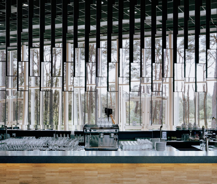
I chose this image because the rhythm of the            glasses and the mirrors behind cause your eye to move in different places. I also like how it is mainly monochromatic.