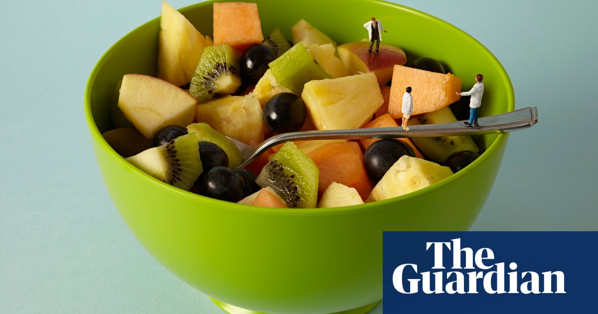
this advertisment is successful because of the background color contrasting with the color of the bowl. the little people on the spoon and in the bowl create interest in the photo itself. the fruits that the photographer chose compliment each other as well as the green in the bowl. I think the lighting in the photo creates a good balance in the photo because the people are on the right side of the photo while the light is on the left. I also like the logo because while it is very simple, and seems to give to the adult aspect of the photo, the little people make it seem more childlike.
for my project, i plan to use pasta. I want to make some kind of pasta string or necklace type things to hang down, i would use uncooked pasta for this. for my first day of shooting, i would use colored uncooked pasta on a white background. then when i shoot the second day, i will do white pasta on colored background.
No comments:
Post a Comment